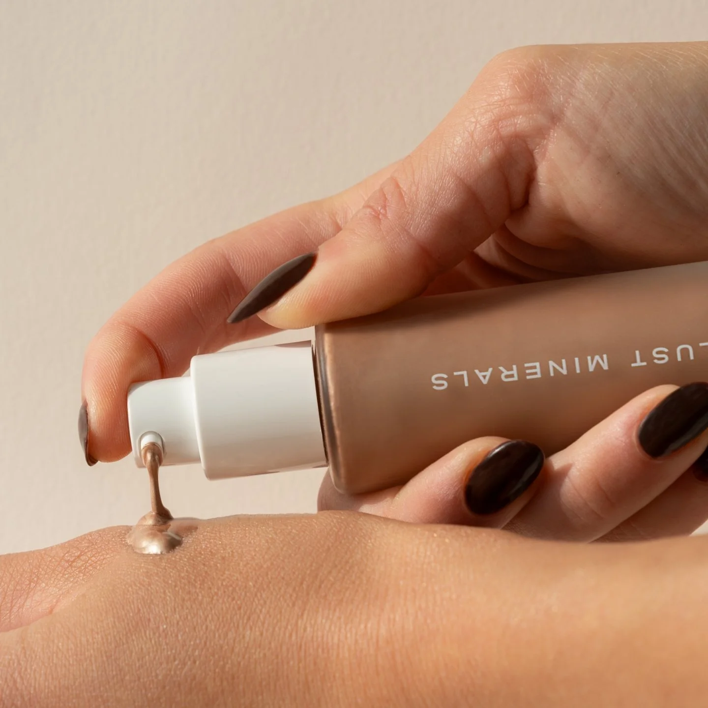
Lust Minerals
Australian Made Clean Beauty BrandsBRAND IDENTITY
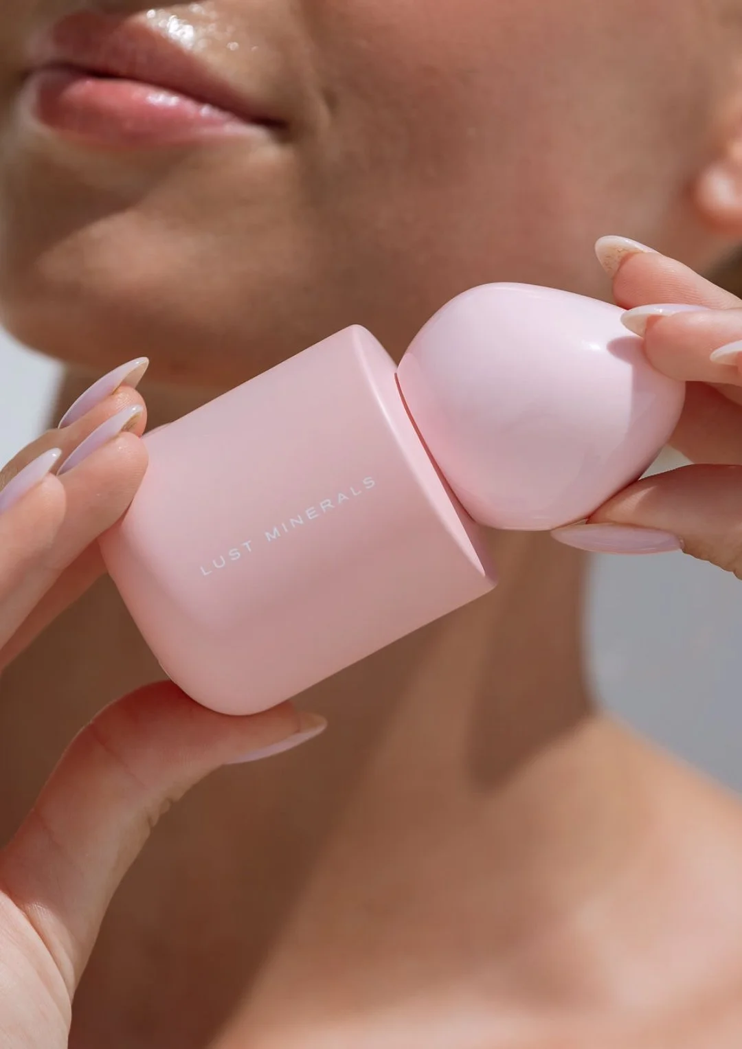
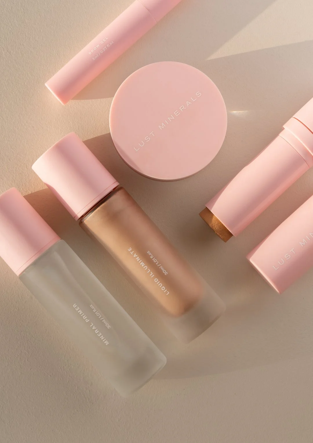
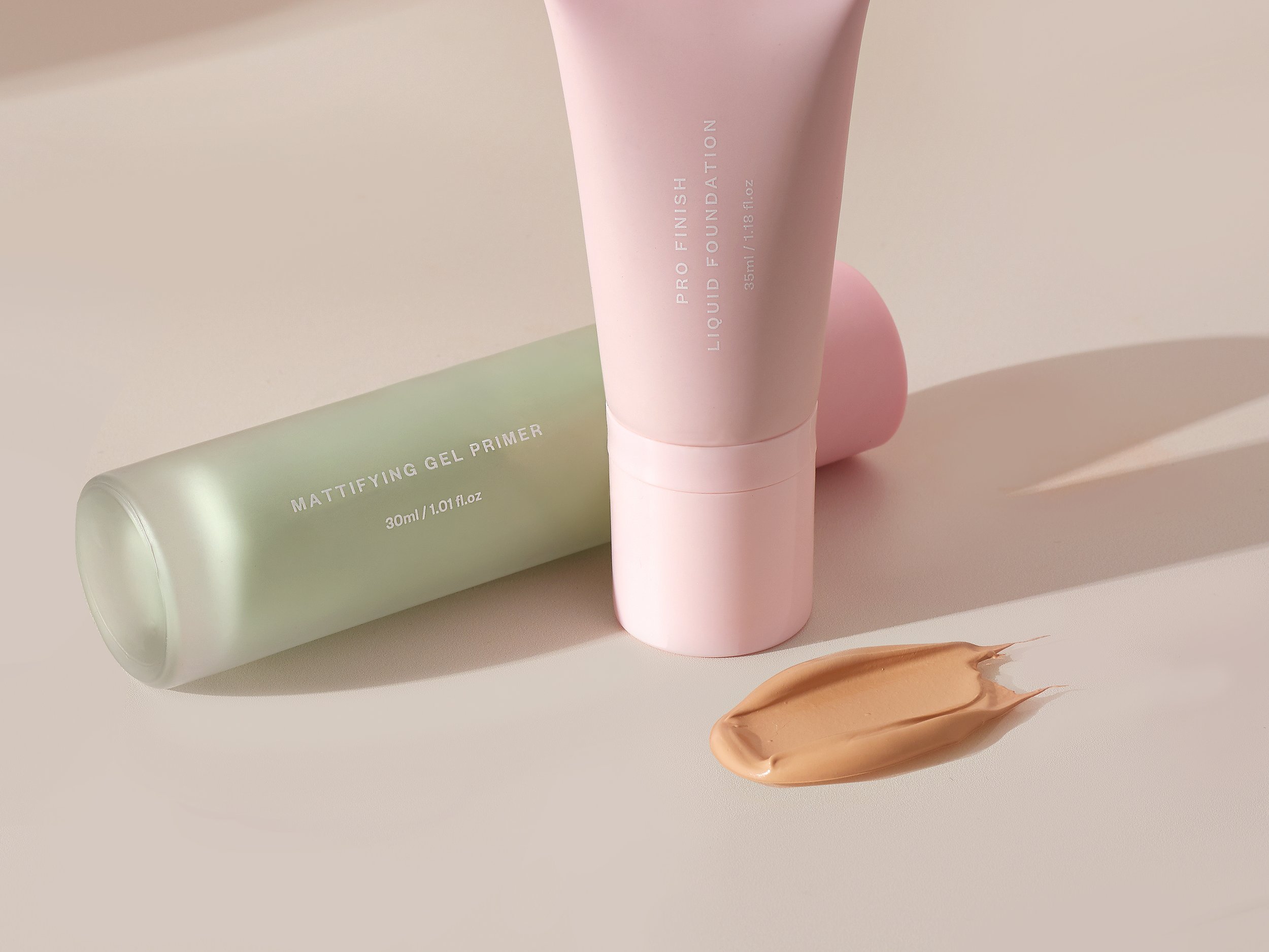
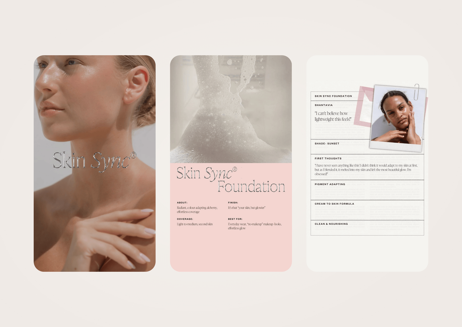
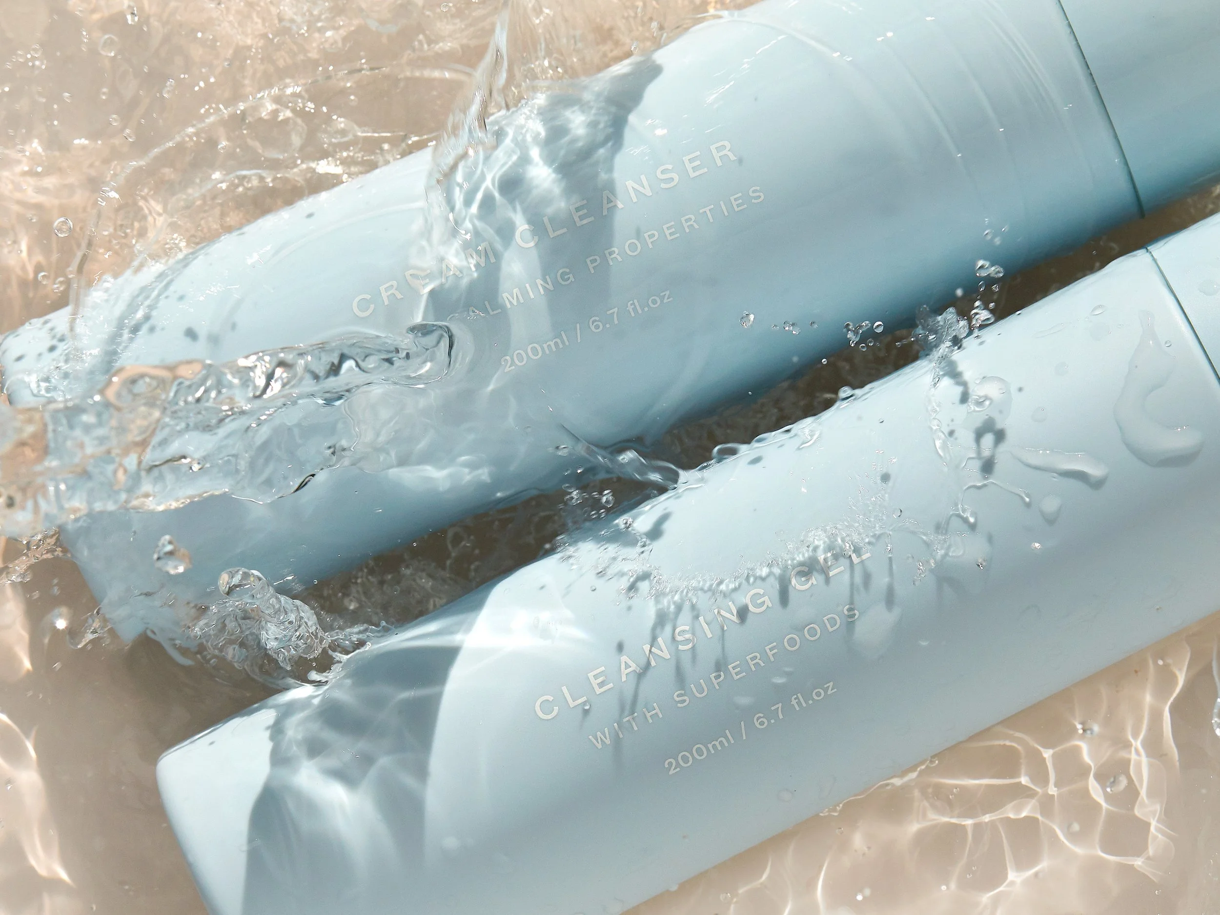
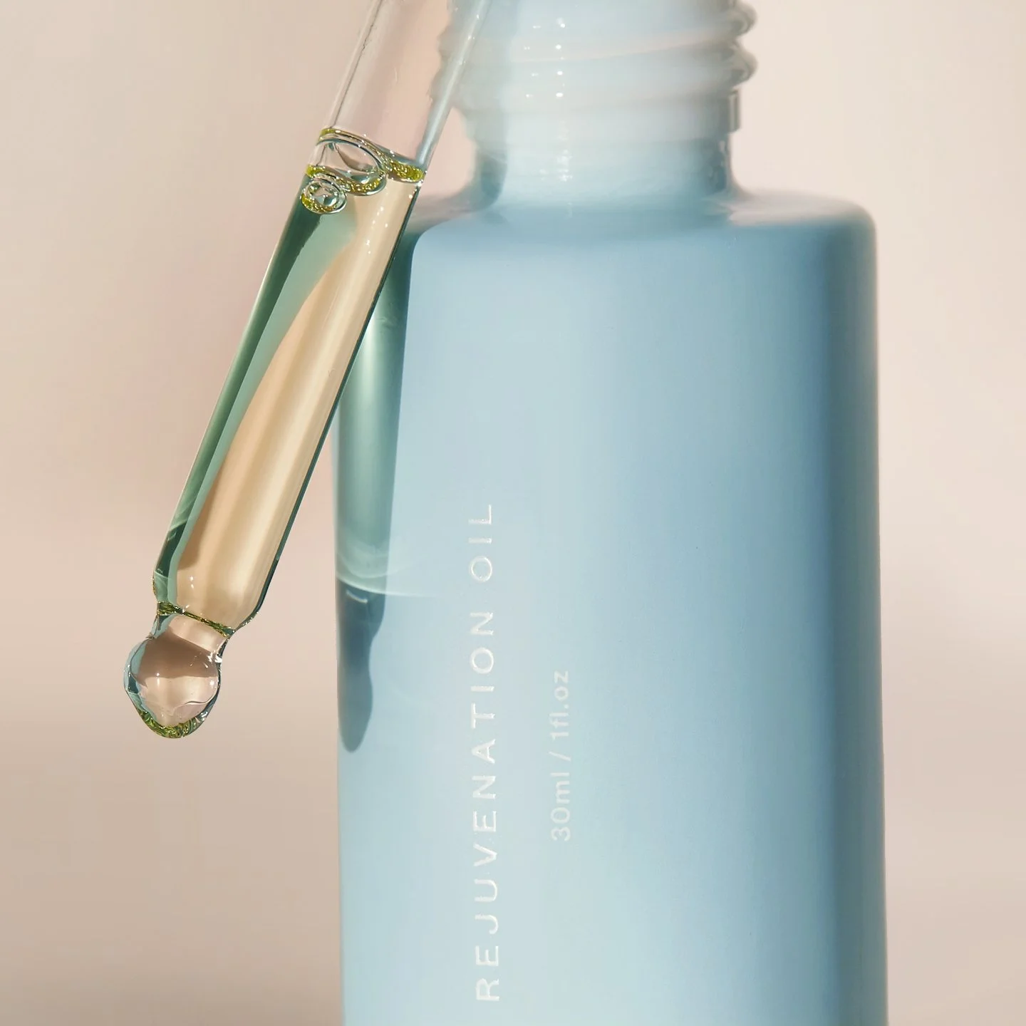
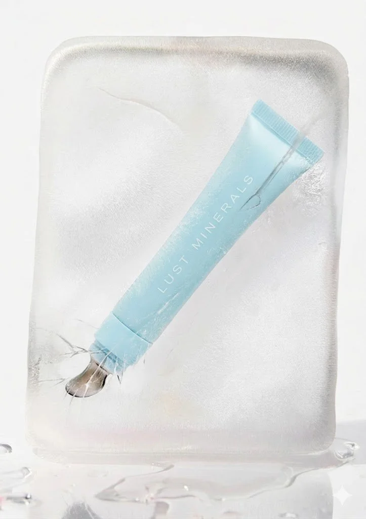
PACKAGING
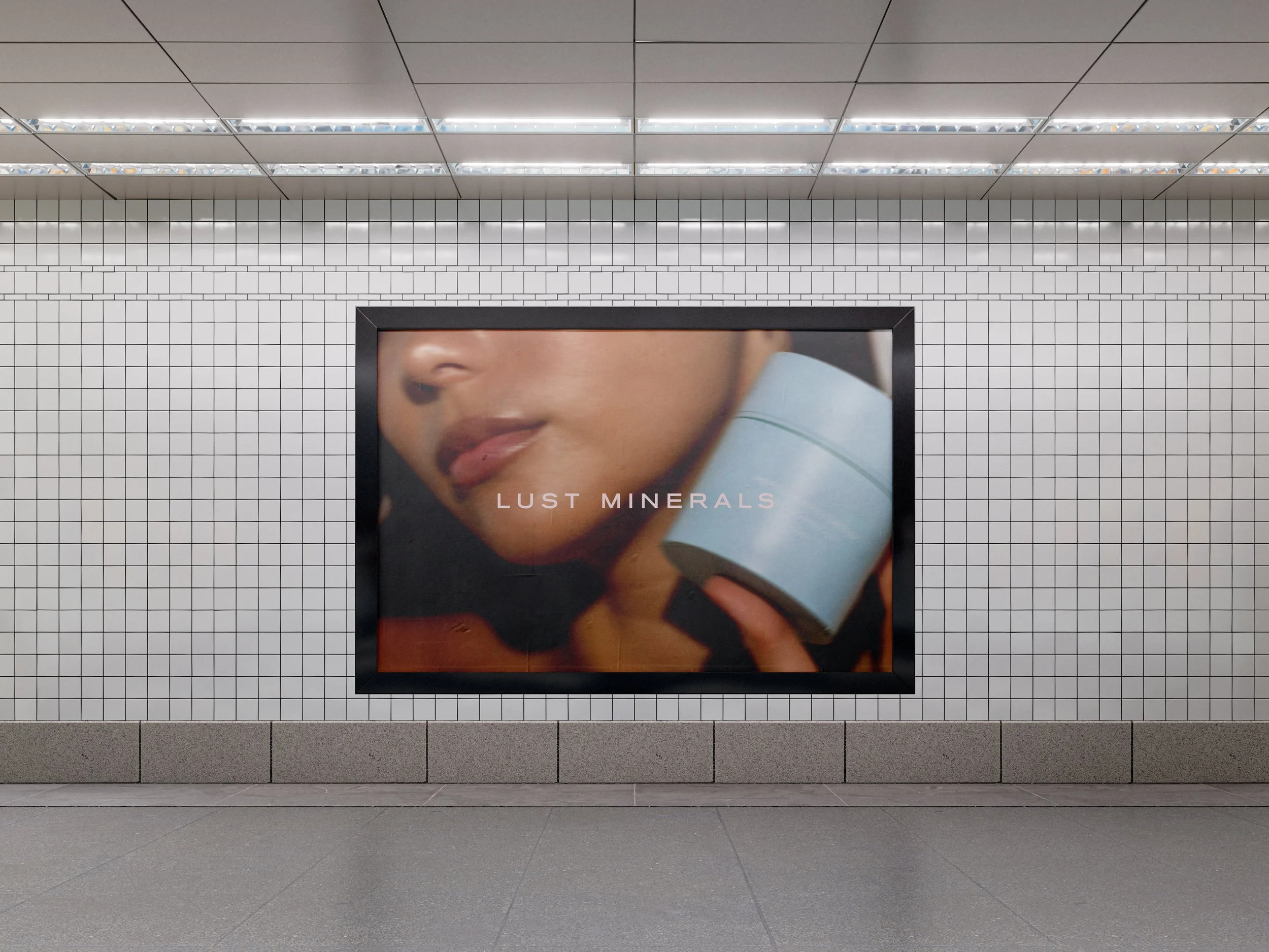
INSTAGRAM STRATEGY
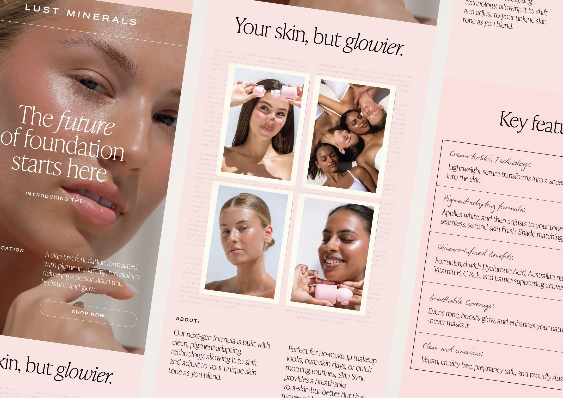
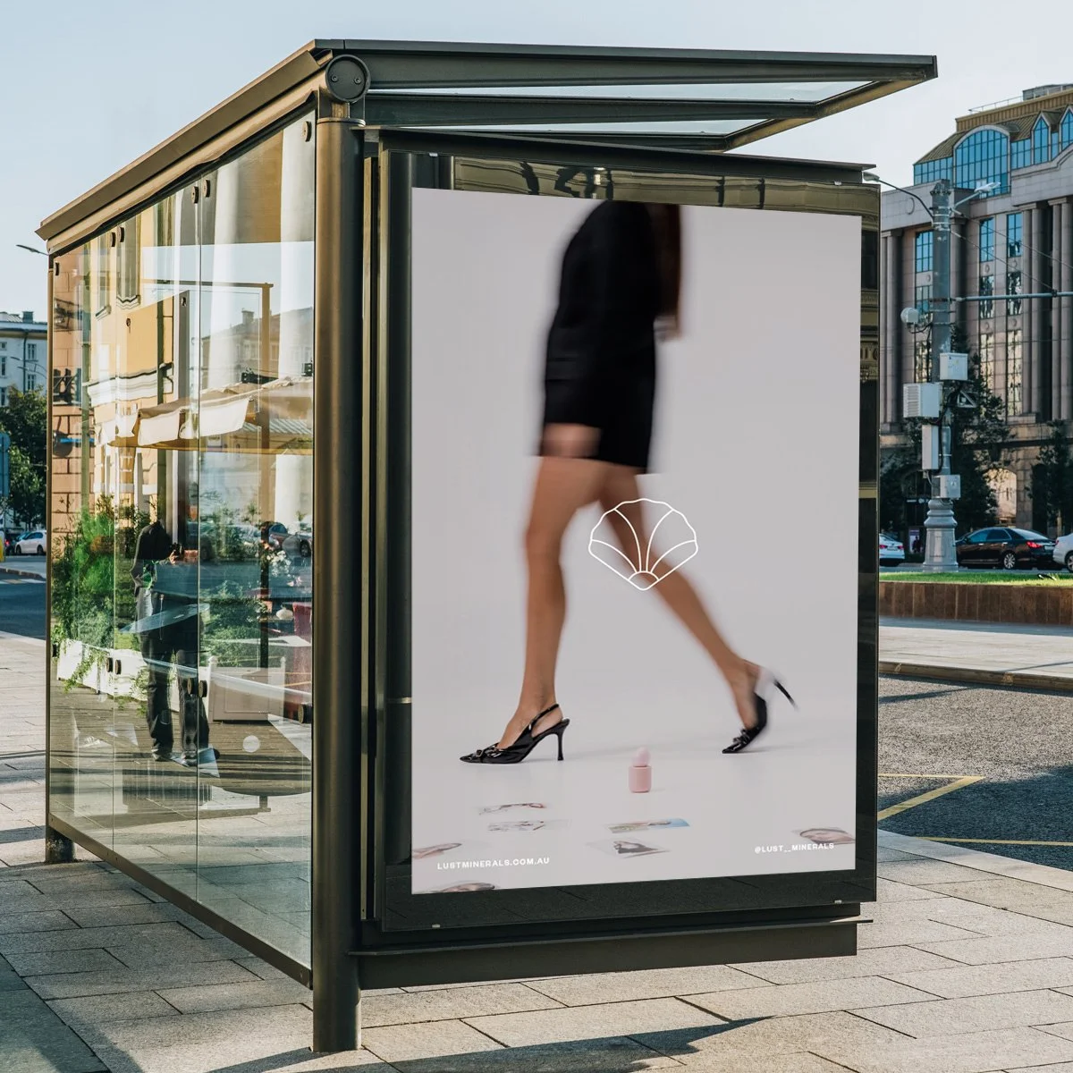
PRINT DESIGN
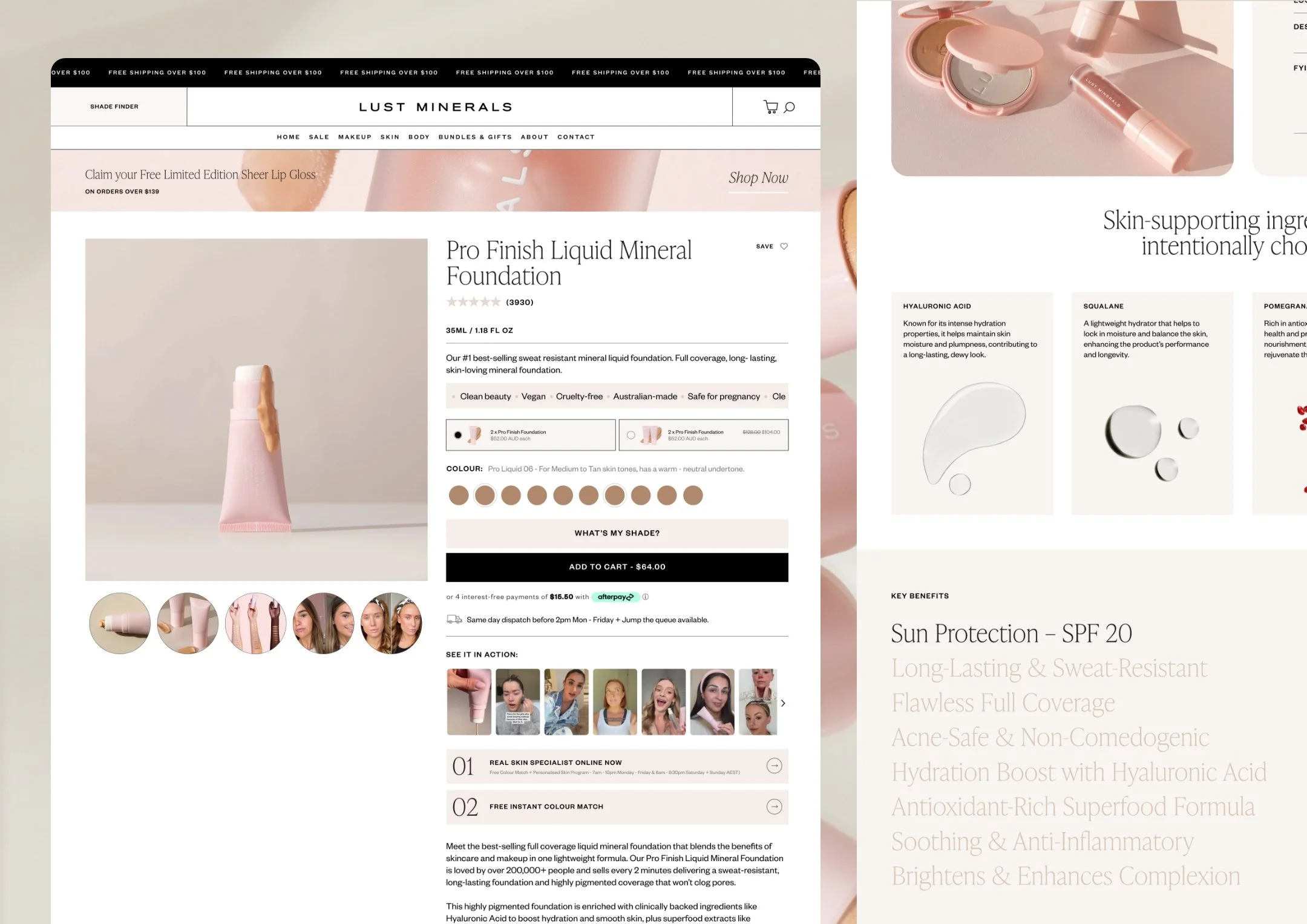
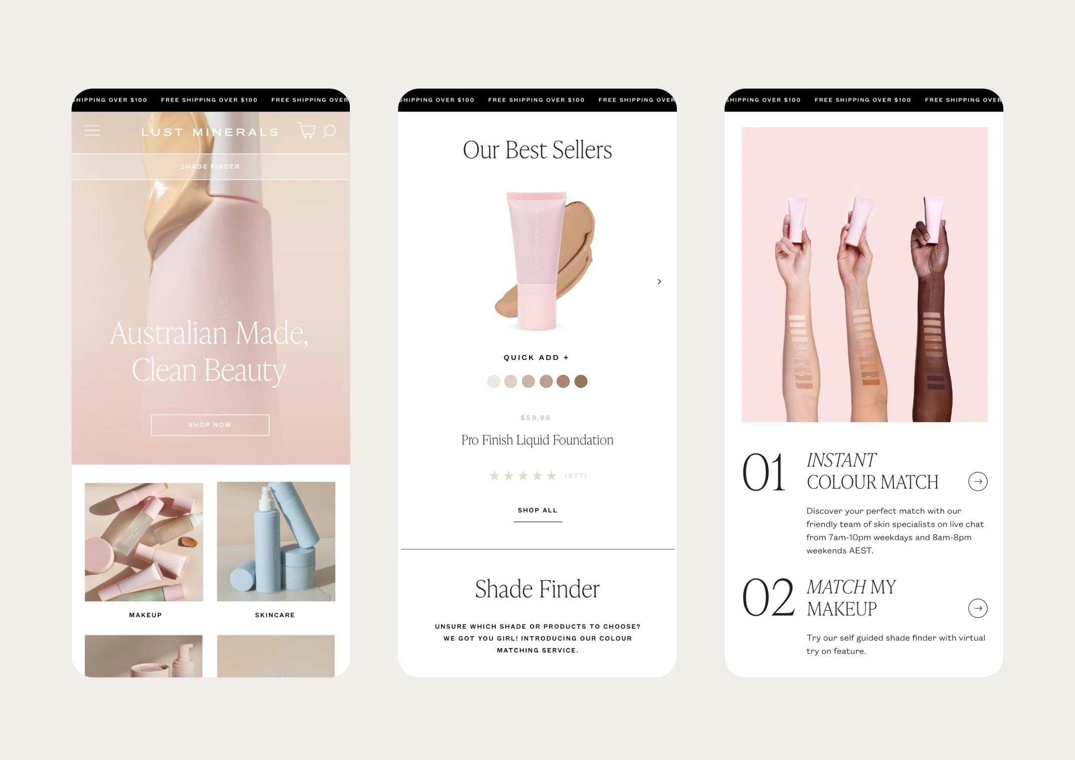
WEBSITE DESIGN
EDM DESIGN
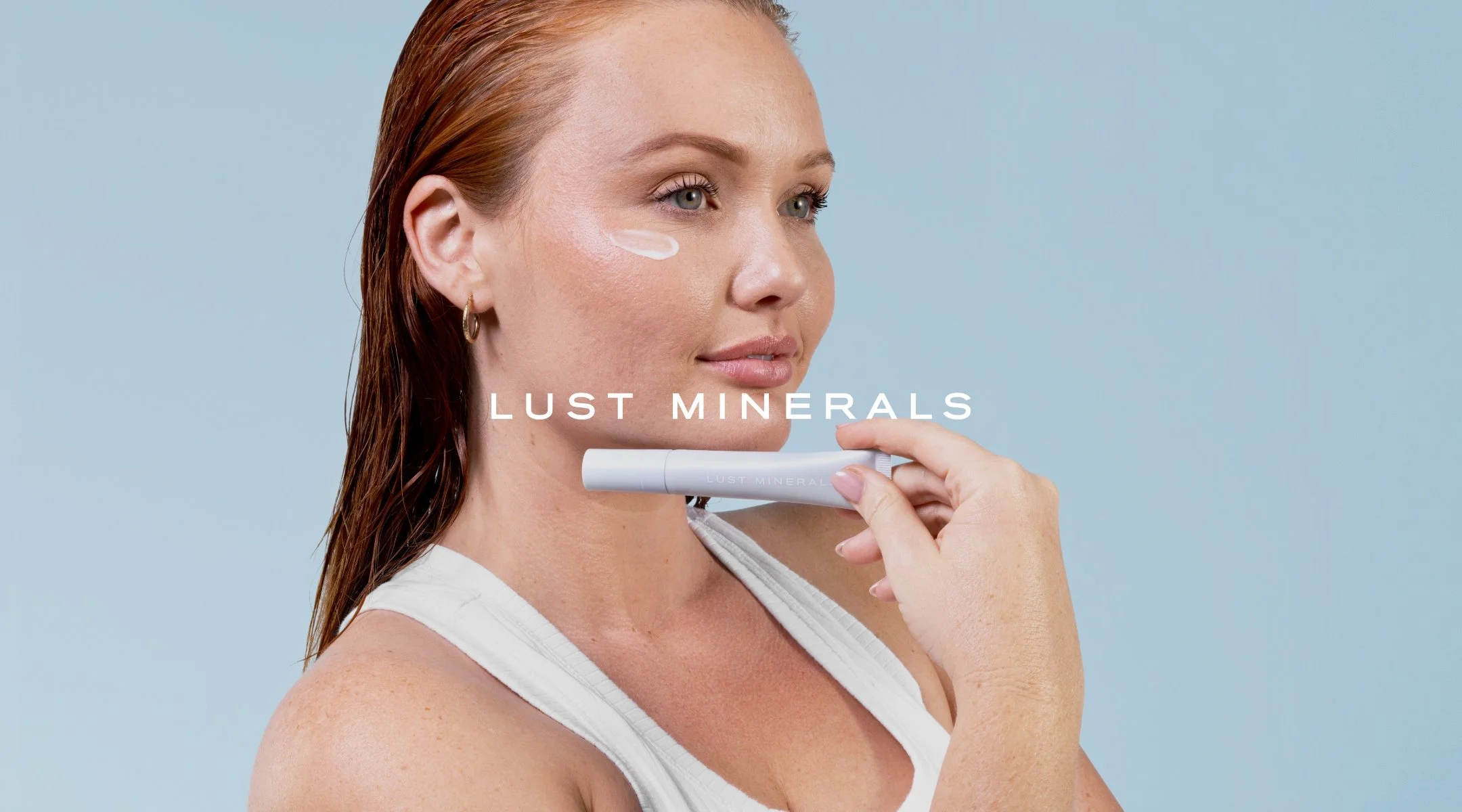
Lust Minerals is Australia's leading clean beauty brand, built on a powerful promise: science-first skincare and skin-first makeup, powered by patented technology and made for real results. With a cult following of over 300,000 and growing, this is a brand that genuinely delivers.
We’ve been working alongside Lust Minerals for four years and counting. What started as a full brand identity redesign has grown into an ongoing creative partnership spanning campaigns, product launches, new collections, and everything in between.
The brief was to create something sleek, minimal, and deeply feminine - an identity with enough versatility to flex across an ever-expanding product range and the kind of campaign aesthetic that stops the scroll. Clean, considered, and consistently elevated, the visual world we built gives the brand room to grow without ever losing its sense of self.
Four years on, the work continues. New launches, new campaigns, new moments - all held together by a brand foundation strong enough to carry whatever comes next.